The 5 UX/UI Design Principles To Create An Engaging & Sticky Mobile App
21 August 2018
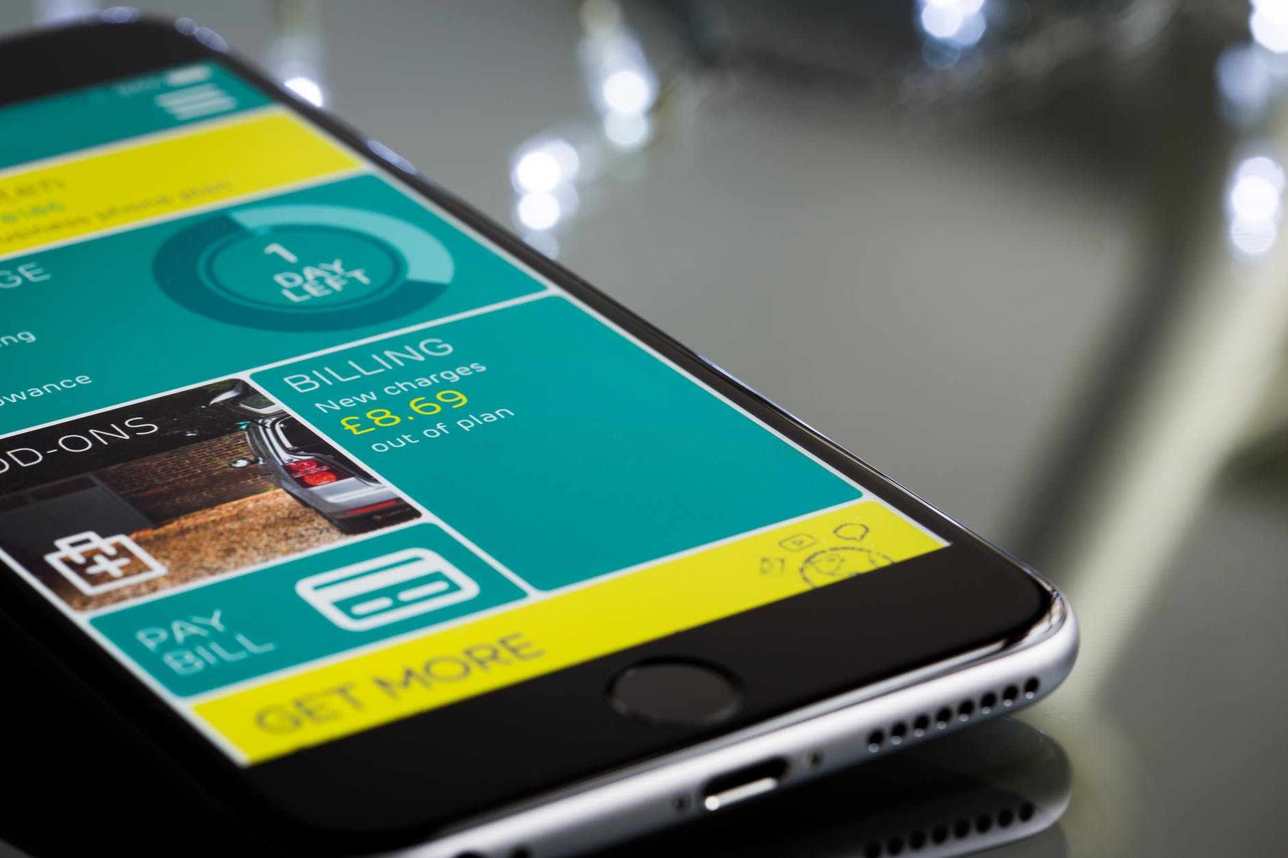
When it comes to developing successful mobile apps, ensuring your app is useful, intuitive and user-friendly are essential to have a shot at creating an app that users would love and constantly use.
While the usefulness of the app is centered around the business or real-life challenges it solves could involve hits and misses, ensuring an app is easy to use is 100% within our control.
In fact, a study by Localytics showed that around 24% of users never return to an app after the first use! The importance of great design should not be underestimated as it is one of the key pillars that will determine if your app is well-received or not.
The most successful apps today (and many of the upcoming ones) all take into consideration key principles in UI and UX (user interface and user experience) that increases the chance of an app becoming a success.
Good UI & UX design helps to:
- Ensure your mobile app is user-centric. People download and use your app to either solve a problem in their lives or be entertained. User-centric apps help improve user experience by making it easier to achieve the end-result and removing all obstacles in the way.
- Bring clarity and navigational ease to the app, removing any possible confusion on how to get from point A to B.
In this article, we go into the 7 top UX and UI principles to maximise your chances of developing a well-received mobile app that users love and spread like wildfire!
1. Have Fast & Practical Splash Screens

Like a homepage on a website, a splash screen is the first thing your user will see when they load up your app.
While there might be a temptation to include every single feature onto the splash screen, don’t! Aim to declutter and only include in the core essentials of the app that will guide your user to step two.
Instead of overwhelming them with all the various elements of your app’s functionality, use the splash page to:
- Capture core information needed to progress: this could be their cell phone number, email address or a Google-sign on.
- Showcase a quick tutorial that will teach your user how to use the app in a few simple steps.
- Serve as a simple intro to your app with your logo.
2. Keep Your Registration Fast & Easy
Do you know that forcing your users to create an account before they explore your app might cost you up to 85% of your potential customers?
While big brands and tech giants like Facebook and Dropbox can afford to make new users create an account to use their product, following their example will prove costly to your business and efforts to grow your user base.
Additionally, with the recent Cambridge Analytica scandal, data use is a big concern that is growing for users both in Singapore, America and the rest of the world.
There are two ways to handle this:
- Allow your users to take a sneak peek around as a guest and see how the app will function while locking away certain features till they sign up.
- Make the registration as smooth and painless as possible. This might require you to either take in only the essential information that is required (perhaps just their name and email) or integrate your app with an API that allows your user to sign-in from their Google or Facebook accounts.
3. Ensure A Finger-Friendly Design For Accessibility
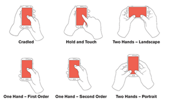
Most apps today are being used on smartphones and as such, design has to be optimised to ensure your app is finger friendly when it comes to scrolling around and button clicking.
A user-friendly app takes into consideration the different ways people will be browsing and experiencing the app.
From one-handed thumb sweeps in portrait mode to two-handed landscape browsing with lots of finger-pressing, it is important for key call-to-action elements such as sign-up buttons to be clear and in the correct size for users to notice and press.
In general, ensuring that your interface elements are clearly visible will help your user experience and prevent their navigation efforts to become a hassle.
4. Focus On Interaction Design
Interaction design is one of the core tenets when it comes to mobile app development. This can be accomplished by goal-driven design and interactive feedback.
Goal-Driven Design: Every app should begin with the user personas and scenarios in mind. By going in-depth into the minds of your users, you can customise your app’s workflow and navigation to nimbly respond to user needs.
Interactive Feedback: Feedback helps to validate the action of a user, allowing them to know that their particular action was completed. Whether it is an email sign-up or a transaction done, a feedback that uses text, image or sound is key to provide instant feedback for every single interaction in a friendly manner.
5. Create A Beautiful App Icon
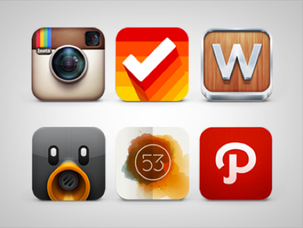
If you are creating a mobile app for the Apple app store or Android store, paying attention to the design of your App Icon is just as important as the design of the actual app itself!
With over 5000 new apps released every day in the app stores, ensuring a beautiful app icon will help your app stand out in a sea of new releases.
A good app design will:
- Allow your app to stand out in the stores, capturing the attention of potential users to give it a try and download it.
- Let your app be instantly recognisable on your user’s home screen, giving it more chance of being used more frequently.
Conclusion
Whether you decide to hire out your app creation to a mobile app development agency or handle it in-house, following these principles will help create an app that users will love to use and maximise the chances of success!
Looking to develop a mobile app? At 24K, our in-house team of developers would love to help!
With over 1000 projects successfully delivered for clients ranging from big corporations to startups and SMEs, we create beautiful apps are intuitive and useful for your users and customers.
Drop us an enquiry today at info@24k.com.sg to get started!


