6 Strategies You Need To Structure Your Website Content For Maximum Conversions
07 August 2018

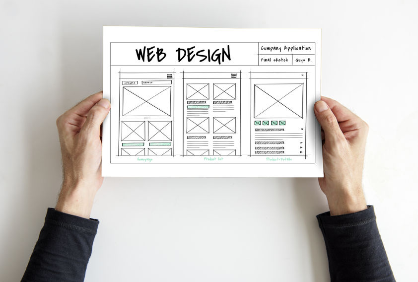
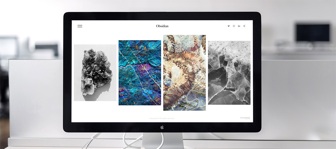
When it comes to website development, most businesses tend to focus on ensuring that the design is polished and their SEO strategy is on point but leave out perhaps the most important aspect of their website - their sales content and how they structure it.
While it is definitely important to ensure your web design gives your visitor an awesome browsing experience and your SEO lets you rise to the top of Google’s search results, it is your sales content that will be the determining factor that turns a visitor into a customer.
In fact the moment your visitor enters your site, their buying experience has begun - even before they have spoken to you or your sales rep.
According to Forrester, a sales research firm:
- More than 66 percent of the buyer’s journey is complete before customers seriously engage a sales rep.
- On average customers engage with 11.4 pieces of content prior to making a purchase.
Furthermore, according to Hubspot, 47% of buyers view at least 3–5 pieces of content before they contact a sales representative - that doesn’t just include your blog articles, but also the rest of your key website sales pages!
Still not convinced? Gartner, a world leading research agency, stated that “By the year 2020, customers will manage 85 percent of the buyer’s journey without interacting with a single human being”. This means the power of content on your website is fast becoming your virtual salesman and it’s time to take structuring your content seriously.
From massive overhauls to slight tweaks, a well-structured sales message could double, triple or even quadruple your conversions giving you tangible business results, qualified leads and sales, all without spending any additional advertising dollars!
Sounds good huh!
In this article, we will bring you through the top 4 most visited content of your website that will influence your visitor’s buying decision and how you can immediately structure them to ensure those conversions go up.
1. Your Home Page
Your home page is perhaps first thing your visitor sees. It is a representation of your entire business and brand and has poorly structured content there might be a key reason why you might be suffering from a high bounce rate.
In order to add in a good dose of clarity to your homepage, here are two steps to get you started.
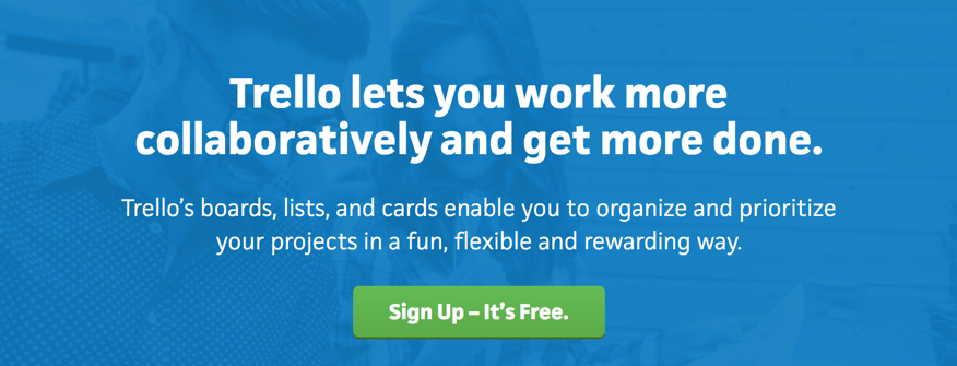
A) Ensure Your Hero Section Content Is Compelling & Clear To The Point
You have less than 5 seconds to capture your reader’s attention at your hero section with a headline that doesn’t just show them the big benefits of your product but is also clear and easy to understand
Whether you are selling a simple product or a highly complex software, going fancy and complicating your hero section is one of the biggest sins many businesses commit. By inserting fanciful jargons that sounds intelligent will probably cause a disconnect with your audience, causing them to not understand your value proposition.
And when someone doesn’t understand what is going on - they click away!
A great way to solve this is by this simple formula:
[End result your customer wants] + [Time Period] + [Address the Objection]
Eg. Create A Landing Page In Just 1 Hour With Zero Experience!
B) Showcase Your Services
While it is rather obvious, it is rather surprising on the number of websites that relies on having drop-down links at their navigation bar to do the job - that is not enough!
When your visitor browses through your homepage, it is always best to assume that this is the only page they will view. And if they don’t get the information that interests them to explore further, they are likely to get just bounce away to another site.
A good homepage will include a brief summary of all (or at least the most popular) services and products your business offers with links that direct them to the individual pages.
2. Your About Page
On average, the second most popular page your visitors is not your product page but actually your about us page!
While this might come as surprise, it is actually quite natural for your visitor to want to understand more about your brand and the story of how the company came to be.
Because of this, it is critical for your about us page to have a really customised and compelling story crafted to portray your brand well. An effective about us page will help to:
- Introduce your company to the world and entrench the credibility of your business.
- Establish an emotional connection with your reader to your brand
- Tell your own personal story and your journey to success
- Showcase your people and team that makes your business possible
Whichever way you decide to craft this page, here are 2 key points you should not overlook.
A) Tell The Story Of Your Company
Yes, making money is important, but I am sure that is not the only motivating reason of why you decided to go into business right?
Many companies make the mistake of populating their about us page with a lazily constructed milestone chart or just a quick description of what their company does - but this doesn’t work anymore!
Tell the story of your company - what motivated you to start this business, what was the core problem you embarked out to change and how did your company evolve over the years. Let your reader know the key steps of your journey and you can begin building an emotional connection with them.
B) Bring Together & Showcase Your Team

The best companies are built on a rock-solid team, and such a team is comprised of quirky, unique and talented individuals with stories just waiting to be told.
Have fun and showcase the people that are making your company possible with short snippets and descriptions.
3. Your Case Studies Page
Whether you are selling a product, service or a high-tech software, having a case studies page is a powerful tool to convince your reader your solution isn’t just great, it is exactly what they are looking for.
While browsing your product pages, your prospect might be thinking if your solution will fit his exact challenge or scenario - after all, his situation is unique and might require a solution that is customised for him.
But the thing is, most customers are more similar and face the same challenges than they think!
Having a well-structured case studies page will allow you to speak to different persona types, each of which will grab the interest of different visitors that browse through your site.
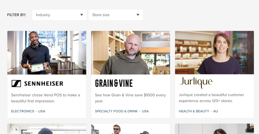
A strong case study is actually an in-depth customer testimonial that reads like a story. It should include:
- The background of the company and how the challenge is currently affecting their operations (lower sales, less time available etc)
- How they heard of your business (through word of mouth, online search)
- Why they decided to choose your solution (It could be due to spectacular reviews, your solution can cater exactly to one of the key problems your competitors could not)
- The process of using your solutions (How was the implementation like?)
- The final tangible and specific benefits they have enjoyed as a result of using your solution and how their business or lives have been transformed.
Conclusion
Having great aesthetics for your website is important, but that shouldn’t only be the sole factor you should count on to win over your visitors. Compelling content that is structured well contributes overwhelmingly to your prospect’s buying journey.
By creating good content that is structured well, you aren’t just portraying your company in the best light possible, you are actually showing you care about the customer and building trust with them - and trust is the absolute first step to successfully getting leads and closing sales online.
Looking to develop a website that delivers effective business results? We would love to help! With over 1,200 web development products delivered, we understand the fine balance between beautiful websites structured with compelling content.
Ready to begin?
Drop us an enquiry today at info@24k.com.sg to get started!


